Now that I am focusing on different area’s of work I have decided to write a tutorial to explain in detail how I went about creating the most popular of all my logos; the death metal logo. This will be a symmetrical, hand rendered, vector logo.
Step 1
First of all, it is important to know a lot about the band the logo is for. What sub genre do they fit in? (technical death metal/progressive death metal/old school death metal) What are the lyrics about? (politics/urban life/religion) What type of audience are they trying to attract? (mainstream/underground).
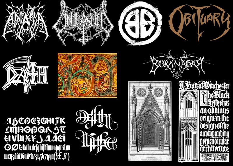
Once you have collected enough information about the band, you can then start researching the relevant visuals. If you are not so familiar to death metal then its a good idea to find as many logos you can to use for inspiration. To make the logo more unique its a good idea to find inspiration elsewhere including religious/medieval/occult symbols, typography, non-metal logos etc.
The logo I am using for this tutorial was for an old school death metal band. They had influences from hardcore punk and the lyrics were about politics and society. I took inspiration from death metal logos, punk logos, gothic architecture, the Book of Kells, Blackletter fonts and ambigrams.
Step 2
You should now start drawing the logo straight onto paper. Start drawing the letters from your influences, if you lack experience in working with typography pay careful attention to the fonts. They dont need to be perfectly drawn or measured, we will use Illustrator to do all of that. Spend a lot of time on the sketches, creating at least 3 or 4 that you are happy with as these sketches will determine how good the logo is.
Some letters are more difficult to make symmetrical than others, use backwards letters if necessary or make 2 thin letters symmetrical to one wider letter. You might want to just keep the first and last letter symmetrical if you want it very legible. Try to keep the widths of the letters as consistent as possible. It helps to understand the basics of typography.
Some letters a more tricky than others to make symmetrical. It is sometimes a good idea to start with the most complex letter, then draw a flipped version of the to use as a template. You can then try to fit the other letter inside the template as best as possible. Sometimes the first letter will still need to modified to get a balance between the 2.
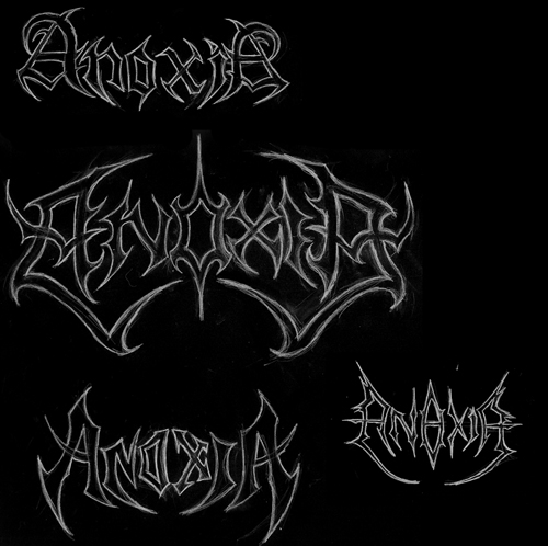
Here are some examples of sketches where I have had to make 2 letters symmetrical with each other. The green area’s are where the template was drawn from the other letter. Once you have drawn around that it should then be erased.
Once you have some sketches you are happy with, scan it in, get the band to pick their favorite.
Step 3
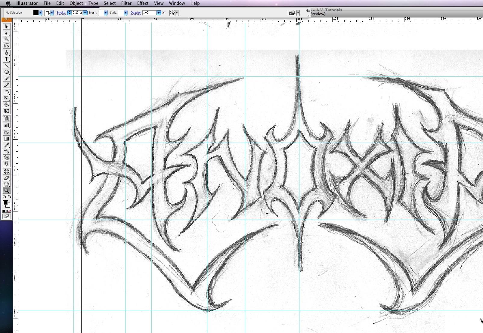
Open up a new Illustrator document at any size/mode. Import > Place the sketches in. Go to View > Rulers. Then drag down rulers wherever things need to be on the same level and wherever you want straight lines.
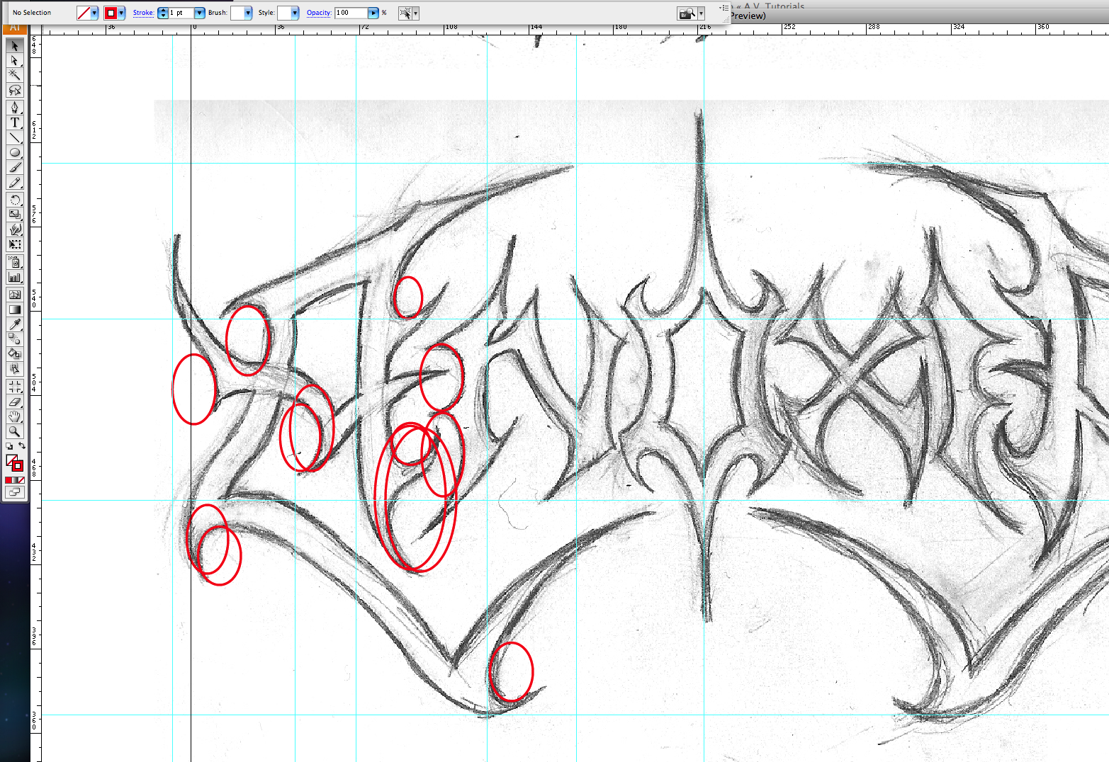
Step 4
Lock the layer with the sketch on and open up a new layer. Make the fill color transparent and the stroke color a bright red. Select the Ellipse tool and draw circles wherever there are curves in the logo. The more thorough you are, the smoother your logo will look.
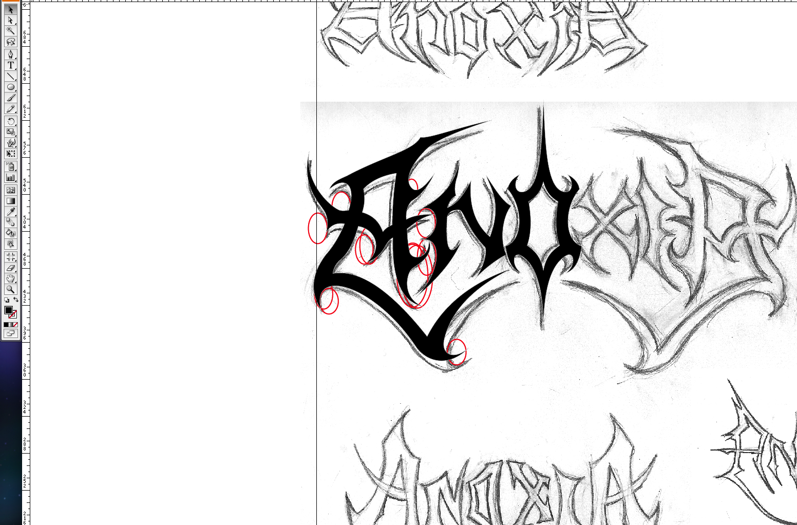
Step 5
Open up a new layer, drag this layer under the layer with the circles on and lock the layer with the circles on. Select the pen tool, change the fill color to black and make the stroke transparent. Now start to draw in the shapes, using the guides and circles to help you. Just do it shape by shape, don’t worry about making everything join.
Zoom in and use the anchor points to get it as smooth as possible. If you have trouble seeing the sketch underneath, go to Window > Transparency and select 50%.

Step 6
Use this opportunity to change any parts of the letters to make them look better. Make sure any symmetrical letters are perfectly symmetrical by drawing one side, duplicating it (alt+mouse) and using the selection tool to flip it over.
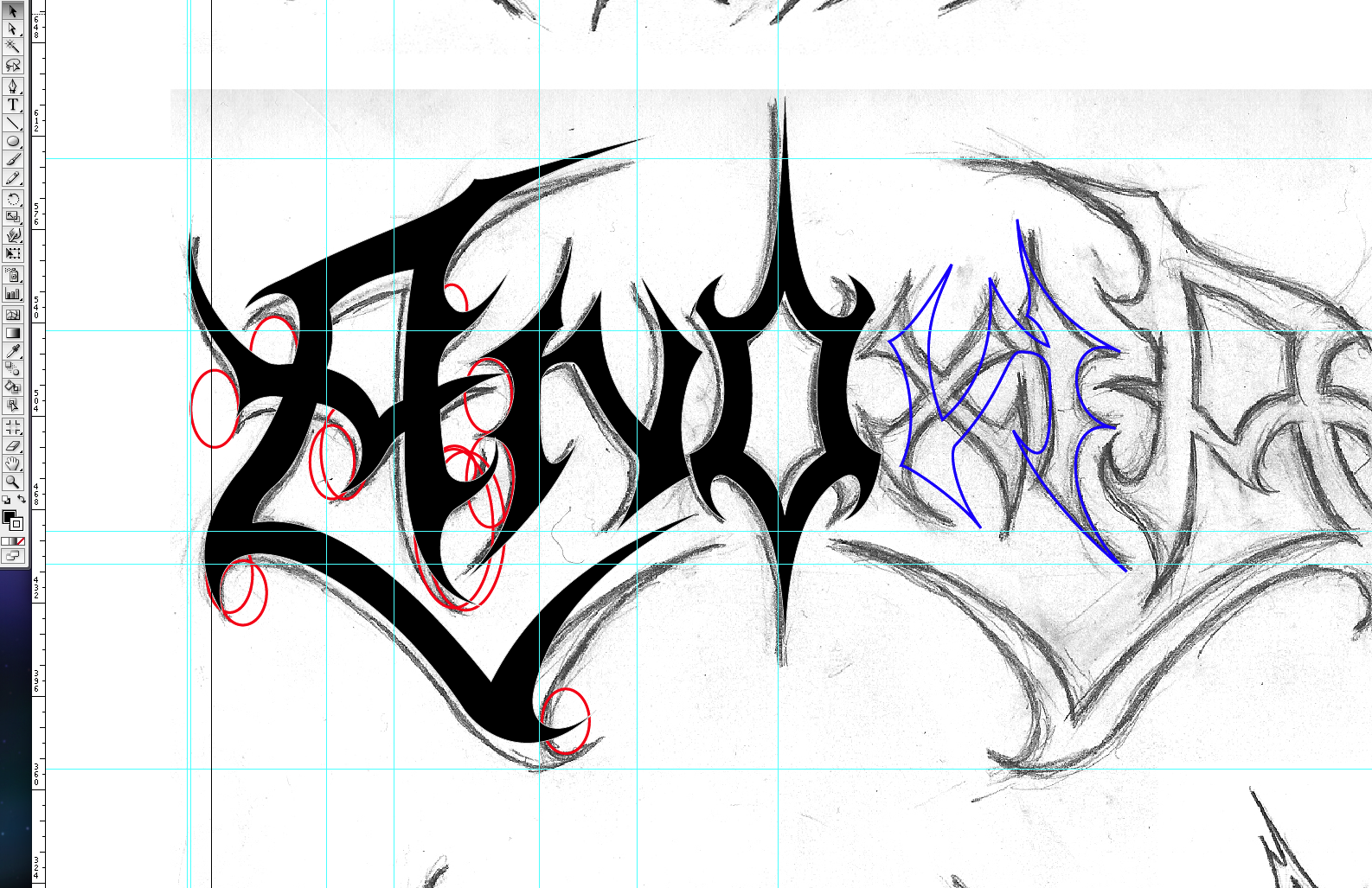
Step 7
Now you have half of the logo complete, create another new layer. Copy and paste all the letters onto the new layer, make the Fill transparent and the Stroke blue. Flip them so they are completely symmetrical to the other half of the logo. Place each letter over the closest matching part of the other side. Lock that layer, go back to the main penning layer. Now draw in all of the other letters using the blue outlines as a guide. Compromise between the 2, this can be tricky, just find a balance of keeping it symmetrical and legible. Keep working at this until you get all the letters the way you want them.
Step 8
Go to View > Grid and use the rulers to give the logo consistent spacing and alignment. If everything looks exactly how you want save the file and go to Export and save as JPG just to show the band and so you can view it outside of Illustrator. Make any changes before continuing.

Step 9
Although the logo is now finished in black and white vector form, bands usually want the logo in different colors and textures. This could be achieved in Illustrator but I find Photoshop is easier to use, although it will no longer be scalable.
Select all the letter Shift+Drag the logo out until the width is at least over 1000 pixels (about three times the width of an A4 page). Select Edit > Copy, open up Photoshop. Open up a new document and paste as a Vector Smart Object. I find that the best ways of creating textures is using textures from photos (www.imageafter.com) to fit inside the letters. Grunge brushes are also useful. Then play around with the layer styles until you have something you and the band are pleased with.

You should now have a professional looking symmetrical death metal logo. If it did not turn out as well as you had hoped, don’t worry, just keep practicing. Learning about typography and really paying attention to detail will help a lot.